Logos and Icons and Wordmarks, Oh MY!
I'll tell you why they're important, and then...I'll make you something beautiful.
Logo and icon (favicon) design is just one element of creating a brand identity. It’s an important element for a writer or content creator to have in place. I work with my clients to home in on the meaningful values they hold, and the message or mission they want to convey to potential subscribers. A great logo that represents you and your brand is a must!
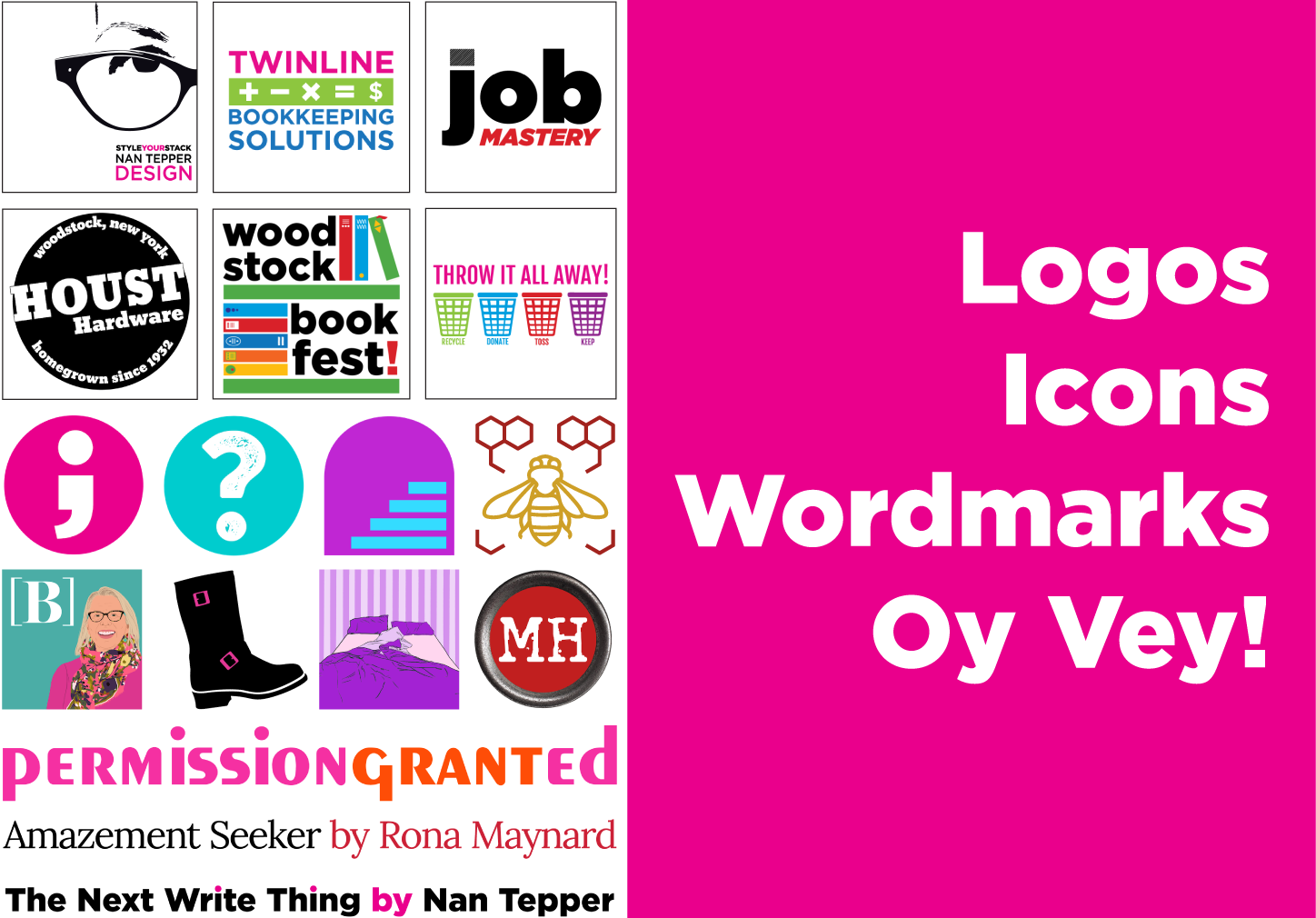
Here are a collection of icons (favicons) that I’ve designed over the years. Favicons are the little images that appear in browser tabs for regular websites. For now, though, an icon must occupy 3-4 different places on Substack. The top left corner of the desktop version of the site AND the Substack app, and the browser tab. It also lives in all the publication lists found on the app. That’s a lot of work for one simple icon. So it has to POP! Simplicity, contrast, and an image with personality are key. They can be initials or some meaningful symbol that only you know the meaning of; a talisman of some kind.


Here are some logos I’ve created over the past 15 years. I can design one for you, for your Welcome page or your About page. It’s more involved than your icon and can serve a purpose by telling your reader more about you. But it can’t be used for Substack’s idea of what a logo is…


And, a wordmark. What’s a wordmark? I’ll tell you. It’s the graphic representation of you stack title. And it shouldn’t be the boring default text that Substack provides. It should be eye-catching, it should be clean-looking, and inviting. It should have flavor and introduce your readers to YOU. Here are some I’ve designed. Wouldn’t you like to look your best, too?
Some examples.


TALENT!!